


From looking at these websites, it is clear that the main focus in information and wayfinding design is communicating categorised information in a clear, simple and logical manner. Conventions include the use of arrows, sans serif typefaces and numbers, and use of universally recognisable symbols. Depending on the client, there is scope for innovation and more adventurous design, whilst still retaining a sense of logic and simplicity.
1.CartlidgeLevene via http://www.formfiftyfive.com/category/wayfinding/


Audience - Youth Genre - School Signage Sector - Public
I would class this an example of high concept wayfinding, and it definitely goes against the conventional and often boring signage used in many primary schools. The almost cartoon sized arrows used to point to class rooms creates something fitting for a primary school audience, and the bold y5, y6 signage categorising the classes in vibrant colours and a simple typeface communicates the information in a very effective way.
Deuce Design via http://www.formfiftyfive.com/category/wayfinding/


Audience - Adults/Tourists Genre - Park Wayfinding Sector - Public
The wayfinding used here, for a national park that was once a fuel storage facility for BP, reflects it's origins in a modern way, utilising the industrial environment as the inspiration for it's design. Everything is sharp and clean cut, and contrasts with the nature surrounding it. It is most effective with the cut out signage, as from a distance, the silver signage may not be as readable.


Audience - Hospital Users/Everyone Genre - Hospital Wayfinding Sector - Public
This is the way finding system for Worcester Hospital, and, due to the broad target audience, (seeing as everyone needs the hospital at some point) the design has to be kept incredibly simple, and use more conventional typefaces and designs. The use of image for the background of the signage, images of nature, appear to be used to create a less clinical environment, as many people are left on edge by hospitals. Again, it is a very effective design, as it communicates all the information in a way everyone can understand.


Audience - Businessmen/workers Genre - Corporate way finding Sector - Private/Corporate
Ininfo are also responsible for the way finding system within 30 St Mary Axe in London, also known as the Gherkin. Due to the corporate surroundings, the design has been kept quite sleek and classic, and the black and greys allow the signage to stand out, but also blend into the environment so that they don't appear garish. The typefaces used are retain the conventions of way finding, and are modern and sans serif.


Audience - Men and Women, stylish/high earning Genre - Department store signage Sector - Private
This is the signage system created from Premier Russian department store Tsvetnoy. Apparently their brief was the make it efficient so that they don't get lost, but not so efficient that they don't have to explore other concessions before reaching their preferred destination. The signage is clearly influenced by the high end, modern surroundings, and it retains a functionality whilst appearing stylish and cool. I think that they signage for the changing rooms works particularly well in terms of illustration, as it is easily recognisable to anyone.


Audience - Unisex/Lawyers Genre - Corporate way finding Sector - Private
Air design have also created signage for the head offices of Pinsent Masons law firm in London. The way finding system has been kept incredibly simple in terms of design, following the conventions of typeface, colour and use of arrows and numbers. The signage works well within the environment, and as it similar in many ways to other corporate signage, it reflects the prestige and importance of the company.

Audience - Students Genre -University signage Sector - Public
This is the signage created for Greenwich university, and the colours and style used reflect the youthful target audience, as the design is quite vibrant and modern. The simple illustrations are effective and functional, and the signage is in keeping with the modern environment of the building.


Audience - Everybody/Tourists Genre - Centre signage Sector - Public
The Albert Dock signage looks great because reflects the industrial style of the buildings surrounding it. It has a modern feel, but doesn't look like it would date very quickly, and the information is presented in a very clear and effective way. Keeping the signage black and white also fits well with the surrounding and the classic typeface connotes a sense of history.


Audience - General Public Genre - Retail Sector - Private
This is the system created for Marks and Spencers, and displays a lot of innovation, in the fact that these signs can be put together very easily, and transported around the store, which is very convenient. The design retains the style associated with the brand, but also updates it with the bold use of colour.


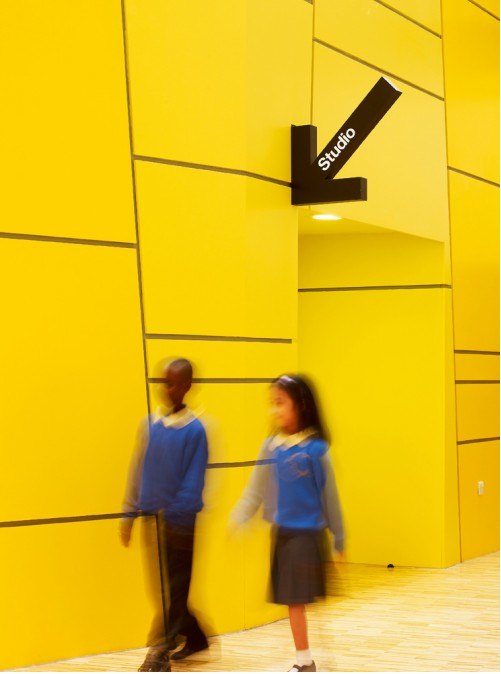
Audience - Schoolchildren and Adults Genre - School way finding Sector - Public
The signage created for this school is again, very simple, but also unique as many other school's signage is nowhere near as considered. The vector illustrations act as recognisable symbols, and they also work well set against the typeface used, which is simple but also adds a sense of warmth and friendliness to the environment.
No comments:
Post a Comment