


From researching and viewing the websites I have presented, I would identify editorial and publishing as a way of presenting a large amount of both written and visual content in a format that communicates it in an organised form. The content is often created for commercial purposes, and so the design must be visually interesting in order to attract its desired audience. The scope for experimentation in editorial and publishing is totally dependant on the audience being targeted, but with publications aimed at the design conscious, as many of the examples I have researched are, there is evidence of innovative and exciting editorial layouts.
Taken from September Industry


Printed in Magazine
Audience: Young, Cultured, Interested in Design.
The editorial of this publication reflects a more post modern aesthetic, which is evidenced by its varied exploration of layout, image, and it's disregard for order and a formal grid system. This style of design has been cultivated to attract a more youthful and hip audience, particularly interested in design, and there is a sense of wit and humour in the content, which is being successfully presented to the audience via the design, which doesn't take itself too seriously.


Ken Leung for Icon Magazine
Audience: Adults interested in design and architecture
As one of the world's best architecture and design magazines, it is important to display that reputation for design within its editorial, but with a high reputation comes a larger readership, which means that the layout design is more classic and simple, which makes the magazine feel refined and contemporary. The simple layout does have some visual interest added to it by the use of different sized columns, and the large, high quality images represent the main concern of the magazine, which is design.
Taken from Published by Process


Process Journal 6
Audience: Adults, Designers/ People interested in design
Process Journal is a quarterly publication that celebrates the work of australian designers. The design of the publication has been created so that the images and visual content take priority, with minimalist layouts containing very little text and uncluttered pages with a large amount of negative space, obviously allowing the work to speak for itself. It looks simple and beautiful, with a confident and considered design.


Process Journal 4
Audience: As above - adults, designers/those with an interest in design
Another issue of the Journal, which again is concerned with the visual content to a higher degree, which is evident in the use of large, high quality images, to create an impact and celebrate the works on display.
Taken from Mag Culture


Kasino Creative Annual
Audience: Young adults, designers.
This is a very interesting design and concept for the publication - using humorous and iconic references about the internet and cleverly incorporating them into the format of the publication means that the reader will be intrigued by it. The editorial has a very simple and quite post modern aesthetic, which appeals to the youthful design audience.


Gratuitous Type Magazine by Elana Schlenker
Audience: Young adults, designers.
From the images shown, although the style of the magazine is quite clearly meant to be experimental, there is a seemingly systematic approach to their editorial design, with the image on one side and the text in a small column on the other, however this could be the only 2 pages where this layout is displayed and I could be horribly wrong. It's still attractive and feels fresh, with large bold images that immediately grab the audiences attention and celebrate the work and visuals.
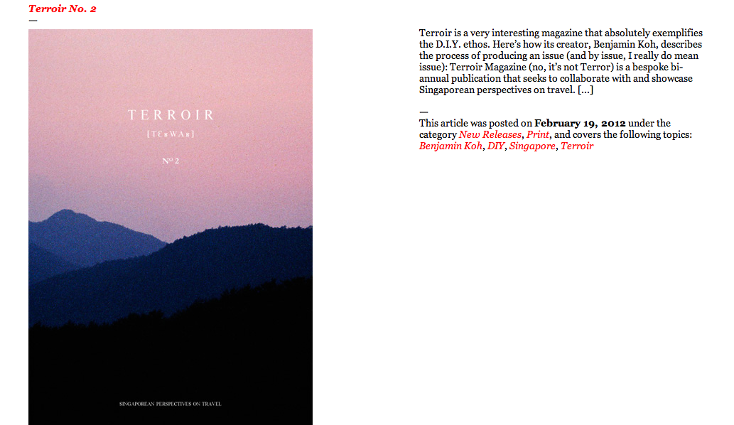
Taken from The Magaziner

Afterzine by Hamish Robertson
Audience: Adults/Designers and those interested in Design
This is very strong front cover for the magazine, which creates an immediate impact, drawing the viewer in. The small use of a bold, beautiful colour creates something unexpected and adds a visual interest which is partly responsible for attracting the readers attention. The layout is also beautiful, and attracts a classy, more adult designer audience.

Journal De Nimes by Tenue De Nimes
Audience: Young adults, possibly more male than female
Again, the use of a bold colour set against black and white photography creates a strong and great impact that attracts an audience, and the luxe contemporary feel of the publication is reflected in the use of stylish typefaces and a strong geometric grid.
Taken from NasCapas

The Village Voice
Audience: Young adults
The Village Voice takes a slightly different design approach to the other publications I have looked at, and there is more textual information alongside the large visual to attract the audience. It creates a strong impact, which it needs to reflect the fact that they are attempting to address a serious issue. The illustration style is effective in communicating the content in a bold way, and despite its cartoonish style, it still feels like quite a serious and strong image.

Collect Magazine
Audience: Young Men
The photographic image that covers the publication's front is strong and forthright, and the main focus and draw of the magazine, and is juxtaposed by the design of the header, which gives it more of a youthful design edge. The small text helps it from looking too cluttered, and overall, the design is attractive and contemporary, and most likely aimed at men.
No comments:
Post a Comment