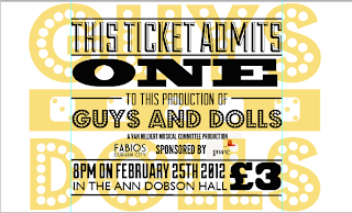
I wanted to keep the designs pretty similar to their ideas, and similar to the styles of work I'd researched online.
This was my inspiration for the poster, which I found on a movie poster archive.
I really liked the nostalgic feel of this poster, as opposed to the other ones that felt slightly tacky. Beth is classy gal, so it was only fair to try and represent her production in a classy way too.


No comments:
Post a Comment